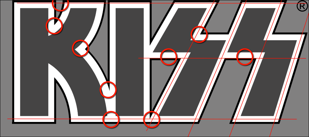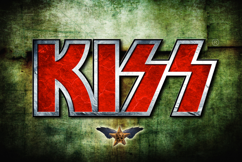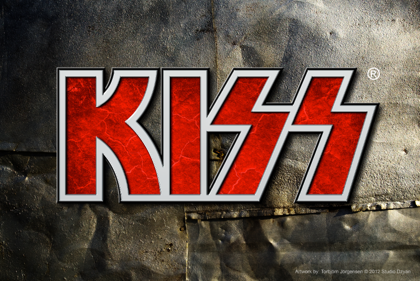
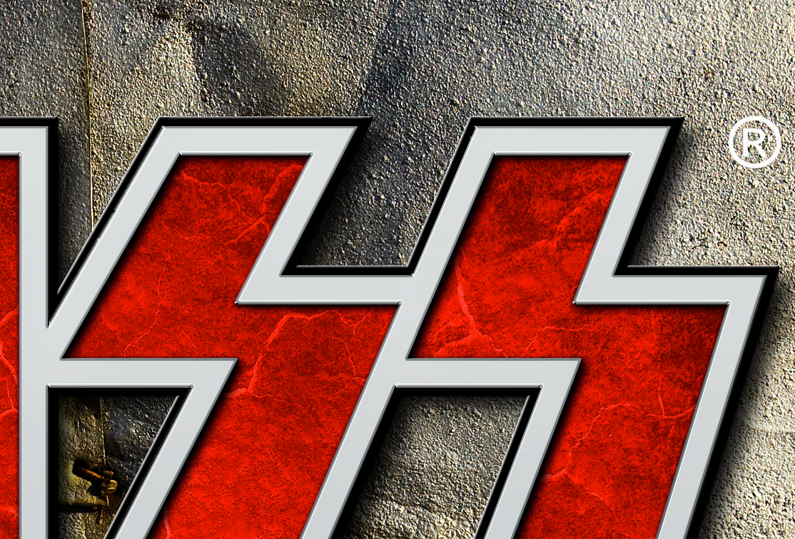
The KISS logotype was cleaned up and adjusted 2011 since the old logotype needed to be available for 3D effects and texturing. The original logo was hand drawn and was not matmatically correct. Crucial parts was the boarder between the two letters S and S.